Case study
Logo Design for backpocket ACE
A new logo and visual direction for June Liu’s project management business, built around the clarity, communication and forward movement she brings to her clients.
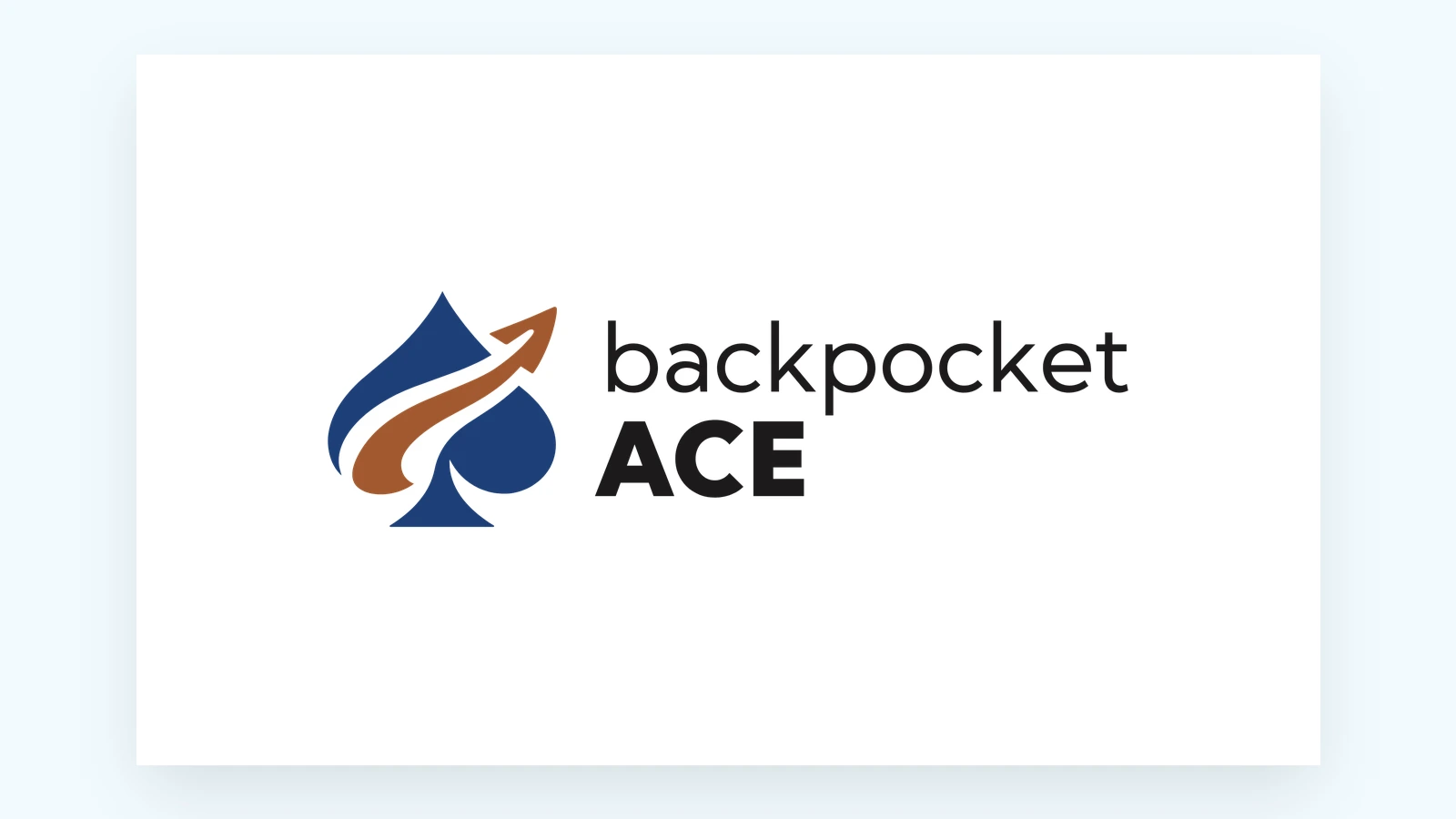
A logo with forward movement at its heart.
Client
June Liu · backpocket ACE
Industry
Project management
Service
Logo design & brand guidelines
The starting point
What They Needed
June helps businesses bring their people, processes and projects together. Her work creates clearer workflows, better communication and the momentum to move forward.
For backpocket ACE, the direction was a professional, modern logo that could reflect that role: a trusted person to turn to when a project needs a way forward.
We developed the logo, color palette and practical brand guidance together, giving June a visual direction she could carry into her online presence. It is the same thinking behind all our logo design for small businesses.
Before
After
The design
What We Built
01 A name with a visual connection.
The spade ties the mark to “ACE,” giving the business name a simple, memorable symbol.
02 A mark that moves forward.
The curved arrow travels through the spade and upward, reflecting June’s work helping clients move through challenges and keep projects going.
03 Structure, with warmth.
Denim blue brings trust and structure. Warm clay adds movement and a human touch. The wordmark pairs a lighter “backpocket” with a confident, bold “ACE.”
04 A version for every space.
Horizontal, stacked, icon and wordmark layouts, in color, one-color and light-on-dark versions, as SVG, PDF and transparent PNG files.
05 A clear guide for the handoff.
Layouts, colors, typography and rules for spacing, size and backgrounds in one place, so June could update her own website with confidence.


Denim
#1E3F78
Clay
#A2592F
Ink
#1C1A1A
Paper
#F6F2F0
One identity, with a version for each space.
What they say
“I’m really happy with where the brand landed and grateful to have had Kim’s experience and guidance throughout the process.”
“She helped bring my new logo and visual direction together in a way that felt like me while also giving me clear, practical guidance on how to actually use the brand across my online presence.”
June Liu, backpocket ACE · Google review
More from our portfolio
More Logo Projects
Landscaping
Logo Redesign for Lopez Evergreen Landscaping
A logo redesign for a landscaping company in Warner Robins, GA: the mark on the trucks, rebuilt as clean files in every size, then cards and yard signs.
Carpet and air duct cleaning
Logo Design for ProVent & Carpet Solution Cleaning
ProVent had a logo they liked as one small image file. We rebuilt it as clean vector files, print-ready at any size, and put it on their first postcard.
Tex-Mex restaurant
Logo Design for La Pasadita Cafe
A logo for a Forsyth, Georgia cafe: a road for the quick stop their name means, a taco that doubles as a rising sun, and Mayan pyramid steps.