Case Study

Logo Design for La Pasadita Cafe

A logo for a family-owned Tex-Mex cafe off I-75 in Forsyth, Georgia, where the road, the taco and the pyramid each carry a piece of what they are.
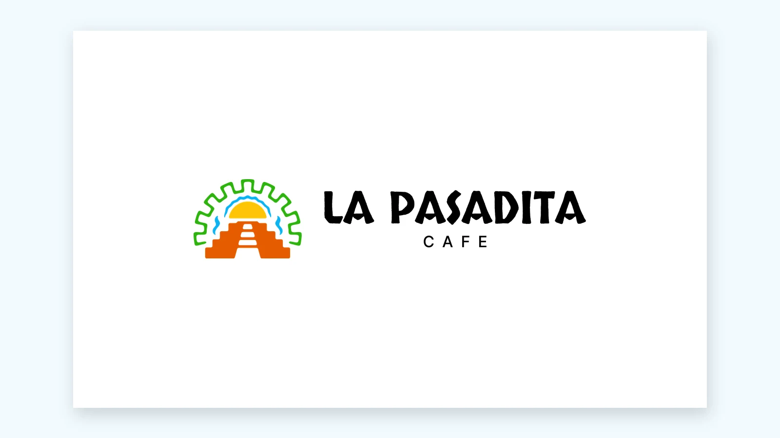
The La Pasadita Cafe logo we designed: an orange Mayan pyramid with a road running up its steps, a yellow taco doubling as a rising sun, inside a green stepped border.

Every detail means something.

Industry

Tex-Mex restaurant

Location

Forsyth, GA

Service

Logo design

Completed

November 2025

What They Needed

La Pasadita Cafe is a family-owned Tex-Mex restaurant on North Lee Street in Forsyth, Georgia, right off I-75. Tacos, tortas, burritos, wings. Pasadita means a quick stop, which is exactly what the place is for the people driving past it. They won a logo from us in a giveaway we ran at the Macon-Bibb Hispanic Festival in October 2025.

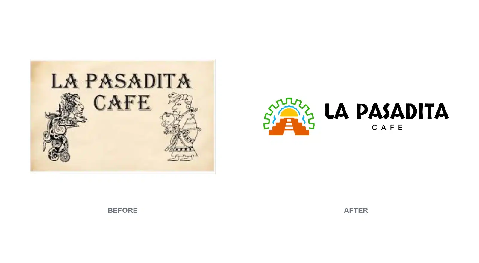
The logo they had was a cream rectangle with the name across the top and two finely drawn Mayan figures standing either side, the kind of engraving with hundreds of lines in it. At full size on a screen you could read every one. Shrunk onto a shirt pocket or a takeout cup, they closed up and went muddy.

So the job was to keep what that sign was reaching for, the roots and the name, and say it in shapes that survive being small, printed and stuck on a wall beside a highway. That is the part of logo design we do for local businesses that takes the longest: deciding what the mark has to mean before deciding what it looks like.

Before

  • A cream rectangle, with no mark you could lift off it
  • Two Mayan figures drawn in hundreds of fine lines
  • Nothing that worked on a dark background

After

  • One mark that reads across a parking lot
  • Versions for light backgrounds and dark
  • Files for a sign, a shirt or a phone screen

What We Built

  • A road for the name. The pale steps running up the middle of the pyramid read as a road going up it. Pasadita means a quick stop, so the road is the idea the mark is built on.
  • A taco that is also the sun. The yellow half circle is a folded taco for the Tex-Mex menu and a rising sun at the same time. One shape, doing two jobs, in the spot your eye lands first.
  • Mayan shapes for their roots. The stepped pyramid and the notched border come from Mayan design, the same roots the old sign was reaching for, drawn now in shapes that hold at any size.
  • Three lockups. Horizontal for signs and headers, stacked for square spaces, and the icon on its own for a profile picture or a stamp on a cup.
  • Four versions of each. Full color for light backgrounds, full color for dark, solid black and solid white, so there is a right file for every surface they print on.
  • Vector files. The artwork is vector, so a print shop can run it on a banner or a menu board at any size without the edges going soft.
  • A brand board. One sheet mocking up the logo on a shirt, a storefront sign, a food trailer and a delivery bag, so they could see how it sits before anything was made.
Before and after: the old cream sign with the name in serif capitals and two finely drawn Mayan figures, next to the new flat orange, yellow and green mark.
Before and after

What They Say

From the owner

“Worked with Kimberly Ortiz to develop a logo for my business. Very sweet and was great with communicating ideas. Logo turned out great! Would recommend!”

Anna Maria, La Pasadita Cafe · Google review
Related Articles

Your business. Your next step.

Need a Logo Like This?

The consultation is free. Tell us about your business and what you want your logo to say. We’ll talk through the direction and what you’ll need.